Turning scientific data into captivating images
Veteran visualization expert Jyrki Hokkanen takes on any challenge thrown at him by scientists in need of imagery – even illustrating particle physics in four dimensions.
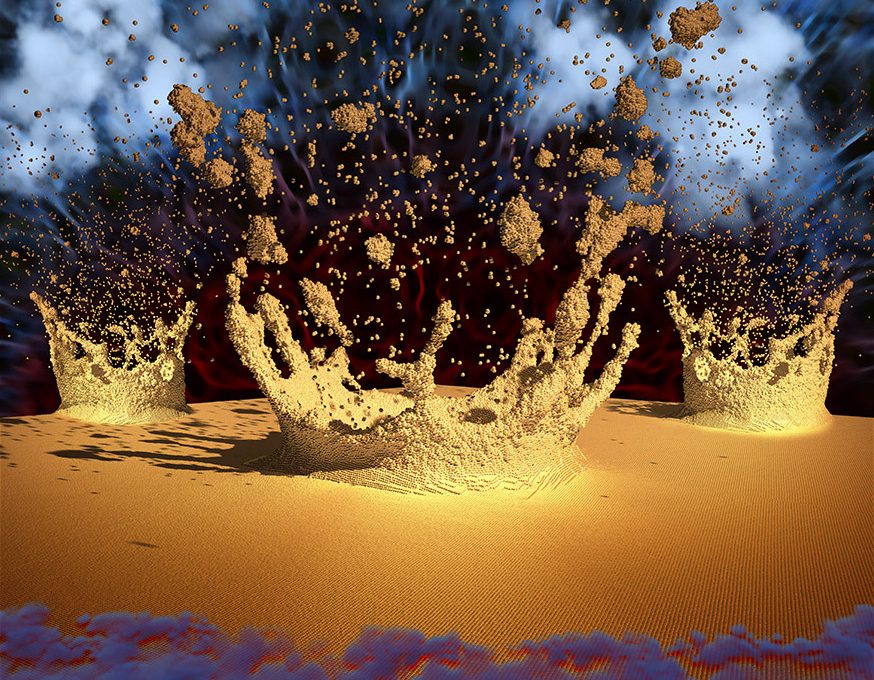
Finnish researchers from all areas come to him, whether it is physics, climate science, biochemistry, or geology. They all need visualizations to illustrate and communicate their findings, and Jyrki Hokkanen’s images are used for scientific papers, websites and posters, or for teaching or promotion. (Image above: Gold-atom clusters colliding with the surface of a gold substrate and forming craters. Simulation by J.Samela, K.Nordlund University of Helsinki).
He works for the Scientific Visualization Service of the Finnish R&E network CSC/Funet, a service provided free of charge for all academic users of the network.
According to Hokkanen, there are two reasons why researchers come to him for visualizations. Either their data is so big or complex that they need help in basic visualization, to get insight into what the numbers mean, or they want to maximise the impact of their findings.
3 million viewers
As an example of impact, in June 2017 one of Jyrki Hokkanen’s visualizations was published on Hacker News List, read by 3 million people daily.
Particle physicists from Aalto University published theoretical work showing that in a transparent medium each photon is accompanied by an atomic mass density wave. The news release was accompanied by Hokkanen’s image and animation showing the propagation of a light pulse through a silicon crystal, and how the optical force of the light pulse sets the atoms in motion.
The novel discovery solves the centennial momentum paradox of light by proving that the special theory of relativity requires an extra atomic density to travel with the photon. Also, this discovery suggests an alternative explanation to the hypothesis of the expanding universe, a fact that caused a lively discussion on the Hacker News website, with many readers speculating on the visualization techniques used.
Particles in four dimensions
As an example of complexity, few tasks match this puzzling challenge given to Jyrki Hokkanen by a group of physicists: Could you please illustrate particle density in four dimensions?
To Hokkanen that was a particularly interesting task, impossible to understand for non-physicists, but being a physicist himself he did. The four dimensions consisted of two spatial coordinates and two velocities. But to explicitly show the density in four-dimensional space is impossible. Yet he managed to provide the researchers the insight they were after, by first plotting the density values in two dimensional velocity-velocity space. He then arranged series of such velocity-velocity space “plates” according to their spatial coordinates, in another two-dimensional space. Although the latter space representation was not continuous, because it consisted of separate plates, the physicists could inspect the trends of the density function visually.
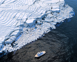
Calving glaciers
Luckily not all of Jyrki Hokkanen’s visualizations are that complex. As an example he has visualized physical simulations of calving glaciers, with colours descriptive of real glaciers floating on the sea surface. The modelled glacier actually exits. It is the Kronebreen glacier in Spitsbergen. The boxy icebreaker is added for fun. It is 100 meters long (simulation by J. Åström, CSC). However, adding elements for fun can be risky business, according to Hokkanen. When it comes to scientific visualization you have to keep a delicate balance between accuracy and visual impact.
All scientists demand precision when visualising their intermediate results. The visual impact is needed afterwards, for attention drawing. When presenting the final results, there are differences among the researchers to what extent they want the visualization to impress, and how to balance between the grand experience and the scientific detail.
But in Jyrki Hokkanen’s own opinion the audience deserves a visual experience. So he likes to include light-hearted details whenever possible, to keep the audience awake and in an active mode.
Through the network
The data Jyrki Hokkanen visualizes is usually produced on the CSC supercomputers, and may consist of millions of files in thousands of folders. In such cases he copies the data internally from the customer’s disk to his own. If the data consists of just a few files, it can be securely sent from any Finnish university via the Finnish r&e network Funet, using the Funet File Sender service, created and operated by CSC. Hokkanen sends his preliminary and final visualizations to customers using CSC’s FTP servers and Funet. And most of his communication with universities in other countries happens through teleconferencing, via r&e networks.
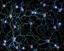
(Image above: Network of neurons, showing active neurons of the brain. This is an example of illustrating science without measured or simulated data, by sketching from various electron microscopy images.)
For more information please contact our contributor(s):